The breeze is warmer, the days are longer, summer is nearer, and the runways are getting brighter! The Pantone Color Trend Report has arrived for Spring/Summer 2021 Ready-To-Wear New York and London fashion week. “Pantone Provides A Universal Language Of Color That Enables Color-Critical Decisions Through Every Stage Of The Workflow For Brands And Manufacturers…” - this is how Pantone describes themselves in their website and they cannot be any more accurate. Pantone is perhaps the most important color company that leads industries visually into the colors that make us. From interior design, textiles, paint coatings and pigments, stage design, film post-production, graphic design, makeup palettes, products packaging, branding, color psychology, fashion design and so much more - over 10 million global visual art industries look to Pantone “to help define, communicate, and control color from inspiration to realization” (pantone.com – about pantone). With their advanced technology, they make the grand effort to observe, create and report what colors are moving what we see, consume, and the colors that will determine what we will see and be inspired by in the future. By announcing the Color of the Year, Fashion Week Color Trend Reports, Graphic Design Trend Report, creating colors for good causes like the Lacoste Everglades shade and so much more, it is evident that one should look to Pantone when it comes to stepping out of the monochromatic black and white and into a world of refreshing colors that could provoke excitement, exhilaration, encouragement, empathy and many more emotions with shades we are familiar with and colors we have been introduced to for the first time. Before creating a graphic or choosing a color spectrum mood board for a film, visual artists and directors look to Pantone for inspiration. Some visual artists and producers actually create trends and create a special mood that Pantone will notice and keep record of that will eventually lead to future inspirations.
Just like Pantone brings colors to life in the paint shades we choose for our homes, the RGB color value we like for our logo, and the HEX tones we determine to be our brand aesthetic, Pantone also reports on the trending colors for every fashion week. They certainly recognize the power colors hold and the emotions they invoke in us (like blues makes us feel calm and reds inspire us to feel hungry), designers are also aware of the importance of colors by being selective in the shades they use to tell the story they want their collection to tell. A perhaps more moving phenomenon is that every season there are colors that are used multiple times in various collections for different labels across the globe, thus becoming the trending colors for that season. Like destiny, these colors collectively represent the mood and inspiration designers and the fashion industry have felt and looked for in common.
For Spring/Summer 2021, designers got together and opted for colors that are sweet, blissful, and everything we expect spring fashion to bring with bright and pastel pinks, fresh-cut lawn greens, tropical ocean blue-greens, and floral hues like lavender purples and daisy yellows. Finding inspiration from Easter sweets, tropical getaways, blooming gardens, and the hope for a more free and open outside world as things seem to slowly get better since the pandemic, the colors most seen this season represented this new wonderland breath of fresh air we are all so excited for. Some fresh neutral colors were also seen, giving classic tones a more lightweight and airy atmosphere to those timeless shades. Let’s have a picnic, smell the roses, and enjoy the Pantone Spring/Summer 2021 New York and London Fashion Week Color Trend Report.
New York Fashion Week Pantone Color Trend Report:
Nature Inspired
In New York, many nature-inspired tones were seen like the “clear skies ahead” Cerulean and France in the springtime inspired French Blue. Some refreshing minty-greens were also seen on the runways like the soothing pastel-hued Green Ash and the brighter, more vibrant classic Mint. These lively summer day tones were seen at Bottega Veneta, Versace, Balmain, Mugler, Proenza Schouler, Gucci, Chanel, Off-White, Hermes, Max Mara, Fendi and more.
Catch Some Rays!
From the golden hour orange Marigold, optimistic and sunny bright yellow Illuminating, and the autumnal (and unexpected) burnt orange-brown Rust - warm shades of orange and yellow were seen a lot throughout New York Fashion Week. These balmy shades can certainly make you feel all warm and fuzzy inside by perfectly reflecting summer sunshine - even the autumn leaf shade Rust with its evident golden undertones. Off-White, Gucci, Proenza Schouler, Versace, and more labels have embraced these colors.
Flower Power
The color spectrum for this season remained hopeful, optimistic, and full of wanderlust and wistfulness for warmer times. Many colors seen in New York Fashion Week Spring/Summer 2021 Ready-To-Wear remained in the pink and purple spectrum like the fragrant purple Amethyst Orchid, blooming and delicious fuchsia Raspberry Sorbet, and the friendly and inviting Burnt Coral. With more vibrant pinks and purples than London Fashion Week, these flower power pinks and purples are certainly serotonin boosting and will bring a smile to anyone that embraces these trending shades. Brands that included these colors into their collection include Gucci, Raf Simons, Miu Miu, Balmain, and many more.
The Classics
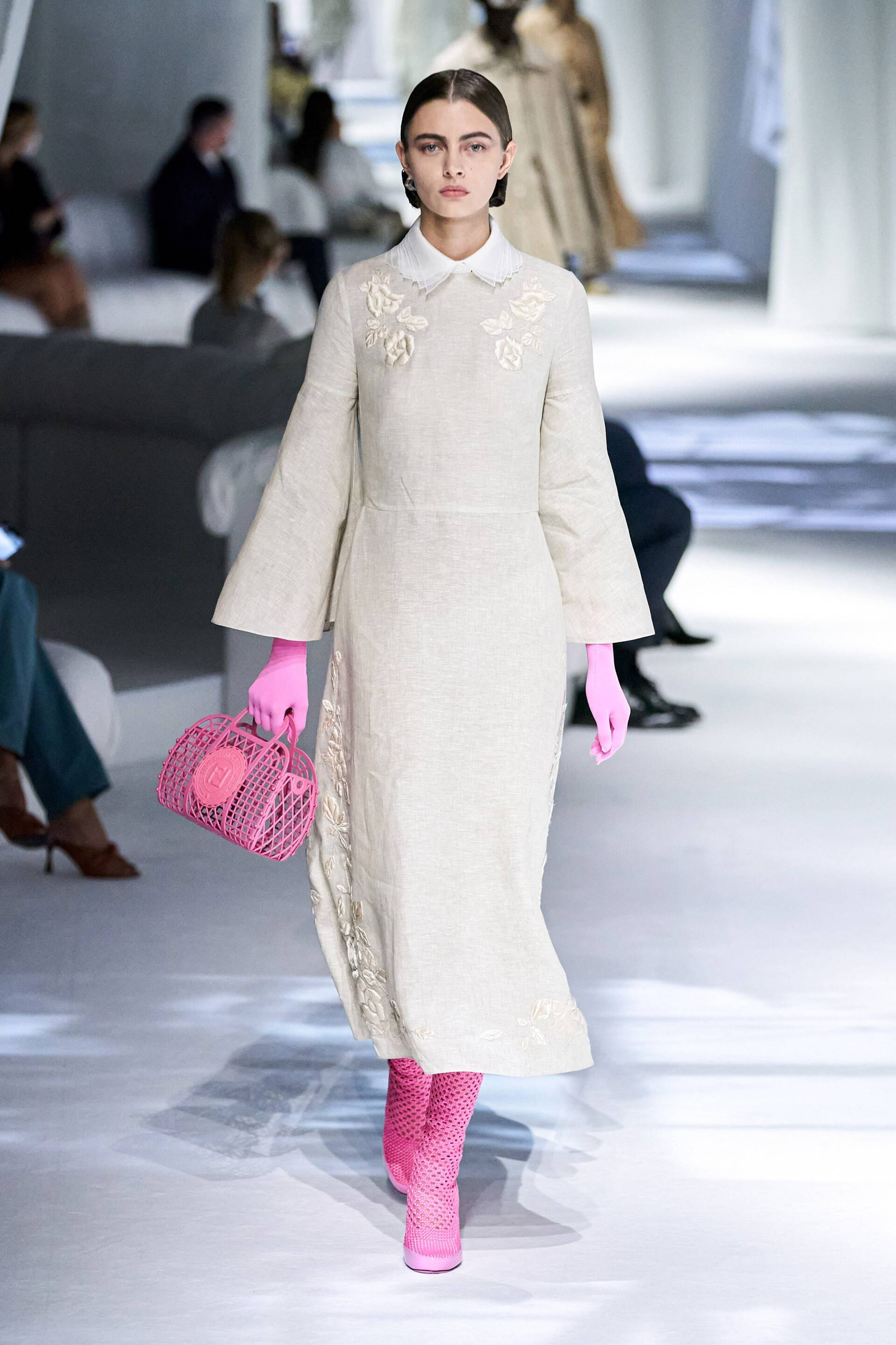
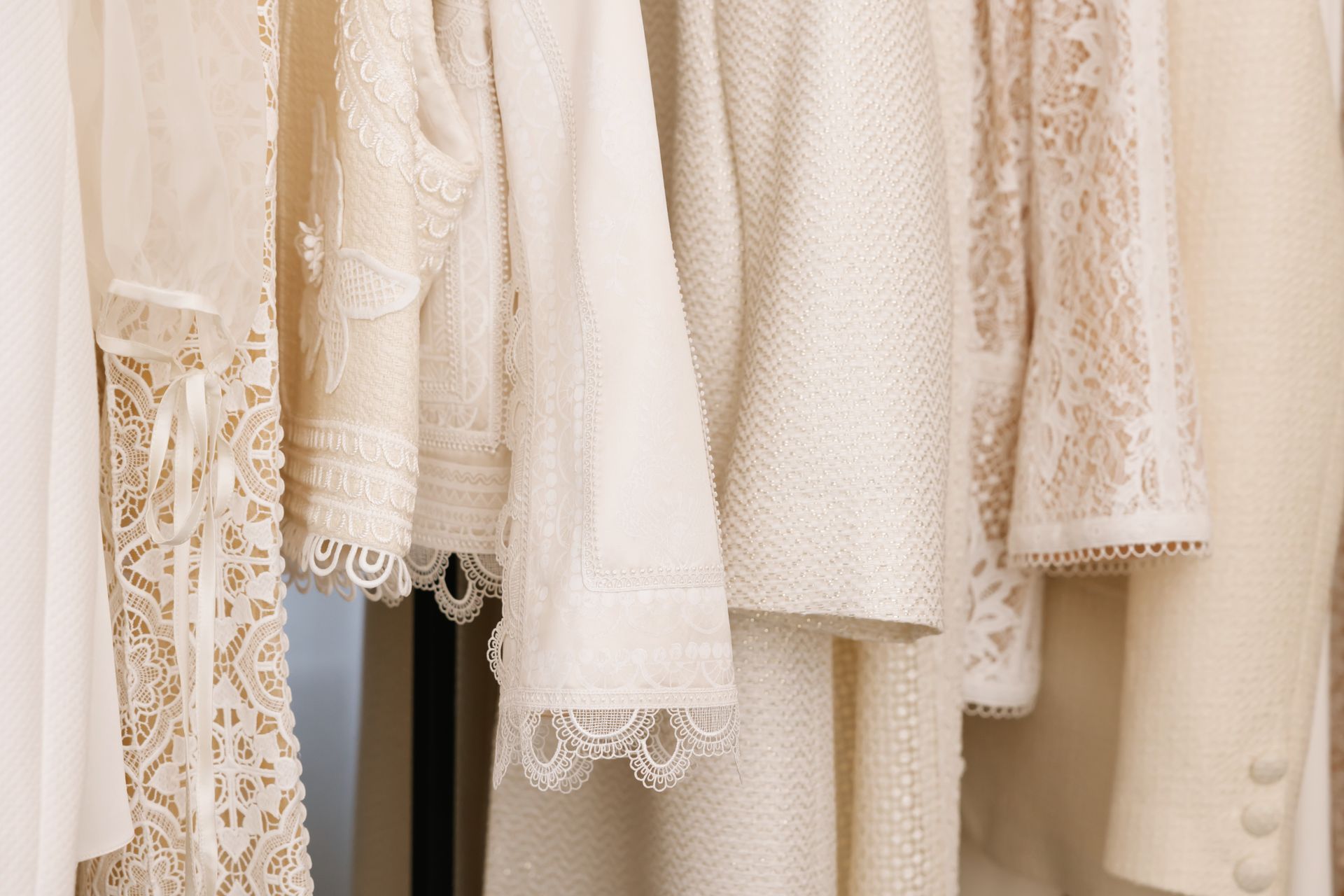
The classic shades most seen was Inkwell, a great black shade with a delicate blue undertone, Ultimate Gray, a pure and prim grey shade, Buttercream, a sweet and effortless off-white shade, Desert Mist, a light sandy and peachy color, and Willow, a beige-green shade that peacefully reflects nature impeccably. These uncomplicated and elegant neutrals were seen at Bottega Veneta, Off-White, Brandon Maxwell, Saint Laurent, Carolina Herrera, Hermes, Alexander McQueen, Celine, Balmain, and Max Mara among many others.
London Fashion Week Pantone Color Trend Report:
Heat Wave
London Fashion Week brought on the heat with the spicy and fiery red Lava Falls, the down-to-earth ember-like Orange Ochre, the comforting soft glow yellow-orange Marigold, and the joyful baby duckling bright yellow also seen in New York Fashion Week, Illuminating. Raf Simons, Altuzarra, Mugler, Gucci, Balenciaga, Burberry, Hermes, and Fendi raised the temperature along with many other designers that embraced these electric reds, oranges, and yellows.
In The Tropics
London wistfully longed for a vacation in the tropics where the sand is bright and pure and the oceans are crystal clear with those alluring blue-greens most long to jump into during hot summer days. Some of these Miami ocean inspired shades include the summer afternoon blue sky Indigo Bunting, the serene blue-green sea shade Beach Glass, and the surf-ready and more vibrant blue-green, Blue Atoll. Designers that decided to catch some waves and include these ocean blues are Proenza Schouler, Raf Simons, Chanel, Alaia, Balenciaga, Balmain, and Burberry.
In Full Bloom
Unlike New York, softer, more pastel versions of the pinks and purples that are trending were seen in London Fashion Week, as well as the perfect flower stem green shade. You can almost smell the flowers with the tender and delicate Sakura pink Pirouette, the enchanting and spell binding Purple Rose, and the garden fresh Pickled Pepper natural green shade. Proenza Schouler, Raf Simons, Mugler, Chanel, Victoria Beckham, and Fendi are some of the many brands that were in full bloom with the garden pinks, purples, and greens trending for Spring/Summer Ready-To-Wear 2021.
The Classics
Of course, London did not disappoint with its timeless and elegant looks with the most inviting shades. The classic colors in London made us feel nostalgic about the cozier occasions Spring and Summer bring us like the camping-reminiscent mossy green Sphagnum, the twilight-black starry midnight sky shade Polar Night, the off-white tropical sandy color Baby’s Breath, the “let’s have a cup of coffee” Macchiato, and the tranquil pure grey shade also seen at New York Fashion Week, Ultimate Grey. Chanel, Altuzarra, Alaïa, Balenciaga, and Hermes are some of the countless designers that included these classic shades into their collections.